

CTA buttons are one of the most important elements of a landing page. They lead directly to an action, and as such, they directly influence conversion rates.
Poorly designed CTA buttons are less likely to see clicks. Well-thought-out CTA buttons, especially those that take into account the size and orientation of the visitor’s screen, are much more likely to convert.

Source: depositphotos.com
Here are our top nine tips for crafting effective CTAs, as well as an example for each to help you improve yours.
1) Use a unique color
The first thing you can do to make your CTAs more effective is to use a unique color for them. This means using a color that you don’t use for any other element on your website.
This will help the CTA button stand out and be much more noticeable. Do make sure that the color you choose does not completely clash with the rest of the page. You can choose a different hue of a color you are already using in your palette.
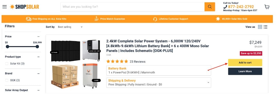
For example, this page on ShopSolar.com uses yellow and black CTAs. The brand’s color is orange, so the use of yellow is only a small step away from that color story. It is bright and vibrant, so the CTAs are very noticeable, but it’s not obnoxious, so it matches the neutral black well.
Source: shopsolarkits.com
Notice how it also goes well with the red that signals a product is on sale.
2) Use the brand’s colors
Sticking to color choice, another way to make your CTAs more effective is to use the brand’s own color for them. This will ensure uniformity on the page while still making them noticeable enough.
This is a good choice for minimalistic websites or those that are looking to appear clean and professional. By limiting the number of colors used, you can convey a sense of expertise and experience and reassure your audience that you can be trusted.
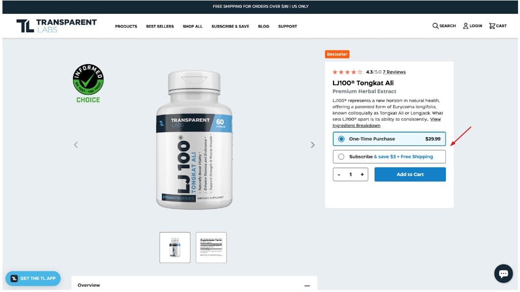
This page on Transparent Labs is a good example. The brand’s chosen color is blue, and they use it in their logo, on their packaging, and throughout the website. By making the CTA buttons blue as well, they’ve achieved a sense of uniformity.
Source: transparentlabs.com
The white space around the blue makes it stand out even more. The color itself is muted, but this clever juxtaposition of light and dark achieves the right effect. The button is easy to spot.
Notice how they use the same blue to highlight the potential savings when subscribing to a regular delivery.
3) Use a very vibrant color
Our last color-related tip is rather a simple one: choose a vibrant shade that will instantly attract the attention of your website visitors.
This will work very well on websites that are trying to make a good first impression or that are trying to stand out in a sea of competitors. By choosing a memorable brand accent color, you can embed yourself in the minds of your target audience.
The color you choose will convey important information about your brand as well, so choose carefully.
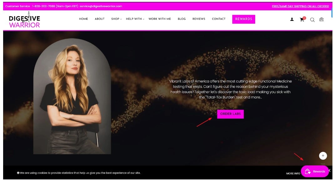
For example, Digestive Warrior has gone for a vibrant pink, almost purple. They’ve made it a part of their logo, they use it in their CTAs, and they use it to highlight the most important elements of their homepage.
Source: digestivewarrior.com
What does this color say about them? They are not afraid to be different, and they want you to pay attention.
4) Write clear copy
Now that you know how to choose the color for your CTA buttons, let’s explore how to write them.
The simplest and most important piece of advice to bear in mind is to write clear CTA copy. It needs to be painfully obvious what the button does. There needs to be absolutely no room for doubt about what a click will result in.
The shorter and clearer you can be, the better. In most cases, two or three words will do. If one of them is an action word, great!
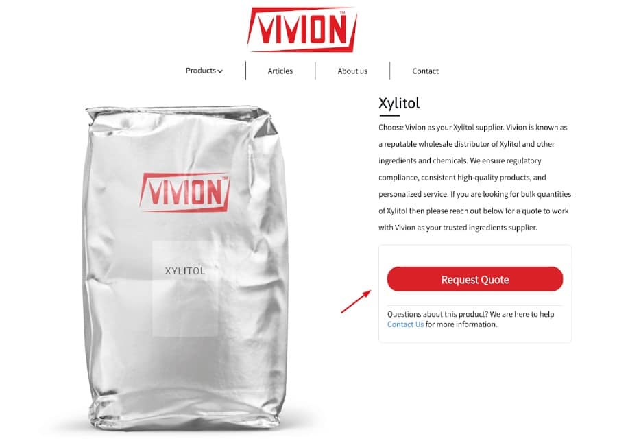
Here’s this xylitol supplier page as an example. Their CTA is straight to the point: request a quote. It’s simple, effective, and leaves no room for confusion.
Source: vivion.com
There are a couple of other CTAs on the page: get documentation and contact us. They are just as clear and simple.
Don’t try to do something extraordinary with your CTA copy. You are trying to optimize conversion rates, not reinvent a perfectly functional wheel.
5) Spell out the benefits
If you want to go down a slightly different route with your CTA copy, you can focus on clearly spelling out the benefits of clicking.
This means the copy will be longer, but you can risk this if you want to stand out or appeal to your target audience.
Focus on the aspects of your product or service that would resonate the most. You can also emphasize features like free shipping, an ongoing discount, and so on.
Basecamp is a good example of a “too long, but still effective” CTA button. Their “try it for free, enjoy work more” solution spells out their two main selling points: they have a free trial, and their tool is meant to help you enjoy your work.
This is a slightly overlong CTA, though, but they can get away with it because it matches the rest of their homepage copy so well.
6) Overcome common conversion obstacles
You can also use your CTAs to overcome the most common conversion obstacles your target audience is likely to have. This can be anything from product quality, shipping costs, returns policy, etc.
Ideally, you will not add any of this information to the CTA button. Even though you’ve just seen Basecamp use an incredibly long CTA with good effect, you can stick to something shorter and spell everything else out next to the button itself.
Expert Photography does this very well, for example. They have a newsletter subscription button that looks completely ordinary, with the email box and submit option. They have, however, added a brief line of text that makes all the difference: Your privacy is safe. I will never share your information.
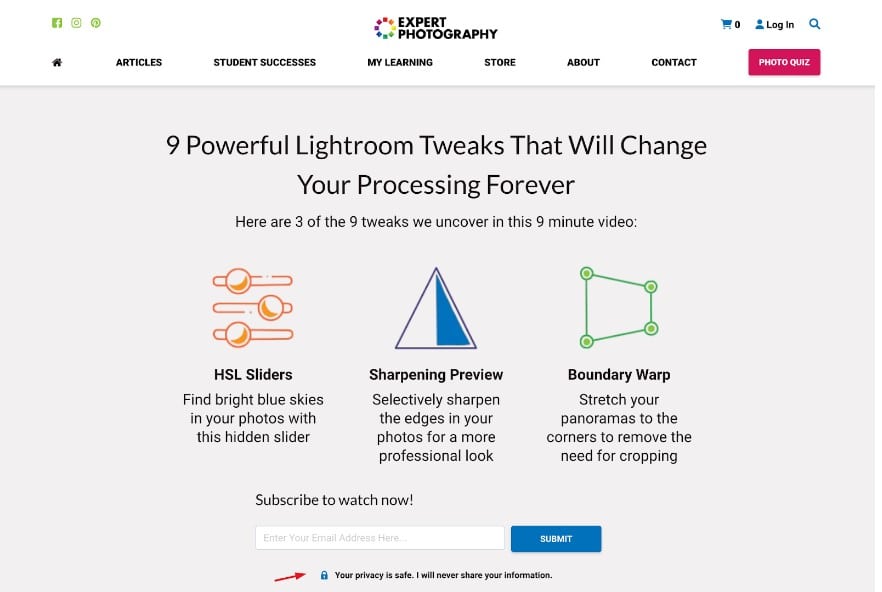
Source: expertphotography.com
In a world where online privacy is far from what it should be, this simple gesture goes a long way in helping readers feel safer about submitting their personal data. A great way to increase subscription rates.
7) Animate it
If you want to add a bit more interest to your CTAs, you can make them move – quite literally.
Depending on the nature of your business and target audience, you might benefit a lot from animating your CTAs. Static solutions work well for more professional websites, but if your brand is more laid back and casual, having a CTA button do a little jig can be a great engagement enhancer.
Case in point: Wethrift has animated all of their coupon CTA. This makes the deal seem just a tiny bit more appealing and like you’re about to cash in on something valuable.
Notice that the animation is short and does not shake up the experience too much. It just adds a bit of movement to an otherwise mostly static page.
8) Use negative space wisely
An incredibly important element of CTA design is the white space that surrounds it. Without it, the button itself would get drowned in the surrounding noise, so to speak.
The negative space around a button will not only make it more visible by providing a contrast, but it will also reduce the amount of distraction. Your visitors will not feel overwhelmed or rushed. Readability and website usability are also improved by the use of white space, as the button copy is made more legible and it’s easier to click on, especially on mobile screens.
Carefully consider the amount of negative space you need around a button. Make sure there are no other clickable elements in the vicinity so as to avoid misclicks and visitor frustration.
Hepper does this very well on their homepage. While there are numerous CTAs to click on, there is enough room between them, even on a mobile screen. Every button is easy to reach, and while they all look alike, they can’t be confused with each other because the surrounding elements make it clear what section of the website you are about to browse.
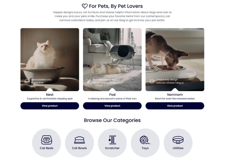
Source: hepper.com
9) Make clickability obvious
Finally, perhaps an obvious tip but one that many websites seem to have overlooked: make sure that the CTA button looks clickable. Don’t just use a link or slightly larger text. Make sure it’s absolutely obvious it’s a button and that something will happen once you click on it.
Look at the Wix homepage. They have several buttons that look exactly like their CTA. And while the surrounding copy does tell you to select the kind of website you would like to create and then get started, the entire section is slightly confusing. Why does nothing happen when you click on “blog”?
In order to avoid this kind of confusion, make sure to have only one element that is clearly clickable.
Wrapping up
Take a look at your current CTA buttons. Did you already follow some of this advice? Or have you discovered there is room for improvement?
Remember that the best CTAs take into account your visitors’ needs and pain points.