
Have you ever been at a meeting when one of your team has presented a report on your website that seems to be nothing but data? An endless stream of figures that you need to really concentrate on to take anything away? Wouldn’t it be great if there was a way of visualizing that data so that what it represented could be understood by everybody?
Heat mapping could be the solution to all those frustrating moments. But what is heat mapping and how can you use it to not only make your job easier but also make important and informed decisions? We look at heat mapping and how adopting its use can change the way you present data.
Understanding heat mapping
Heat mapping is a process where you take important data from your website and represent it visually. This allows people with no technical or data-related knowledge to understand what the data is saying. You don’t need a data engineering certificate or any other formal qualification to either construct a heat map or to read the data.
Heat maps were developed by a serial fintech entrepreneur, Cormac Kinney, back in the 1990s. His initial idea was for financial traders to understand data better and quicker and be able to beat the markets but its use has since been extended to include almost any type of website user data.
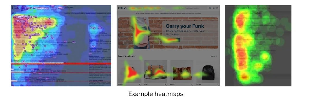
Image sourced from fullstory.com
Knowing how people interact with your website allows you to make improvements where needed. It can identify pain points (and potential pain points) and may also highlight areas of your website that are causing high bounce rates or preventing high conversion rates. They can also help you understand user behavior so you can provide a better customer experience.
The main types of heat maps
There are four primary types of heat maps. These can be used for different purposes and work in different ways.
How useful any will be depends on what you want to know and how you organize your data. You may want to ask questions about data flows, such as what is medallion architecture?
1. Hover maps
Also known as ‘mouse movement tracking’, this is perhaps the most inaccurate of the heat map types. The idea behind hover maps is that they track where users hover the mouse button. There is an assumed correlation between where the mouse hovers and where users are looking but this is not always true. After all, how many times have you been looking at something while you unconsciously move the mouse about?
The use of hover maps is thus limited as you cannot be sure how accurate the results are. Although eye-tracking can help you understand how a user navigates around your site, hover maps can’t really tell you what elements may have attracted their attention or give you in-depth insights into their browsing behavior.
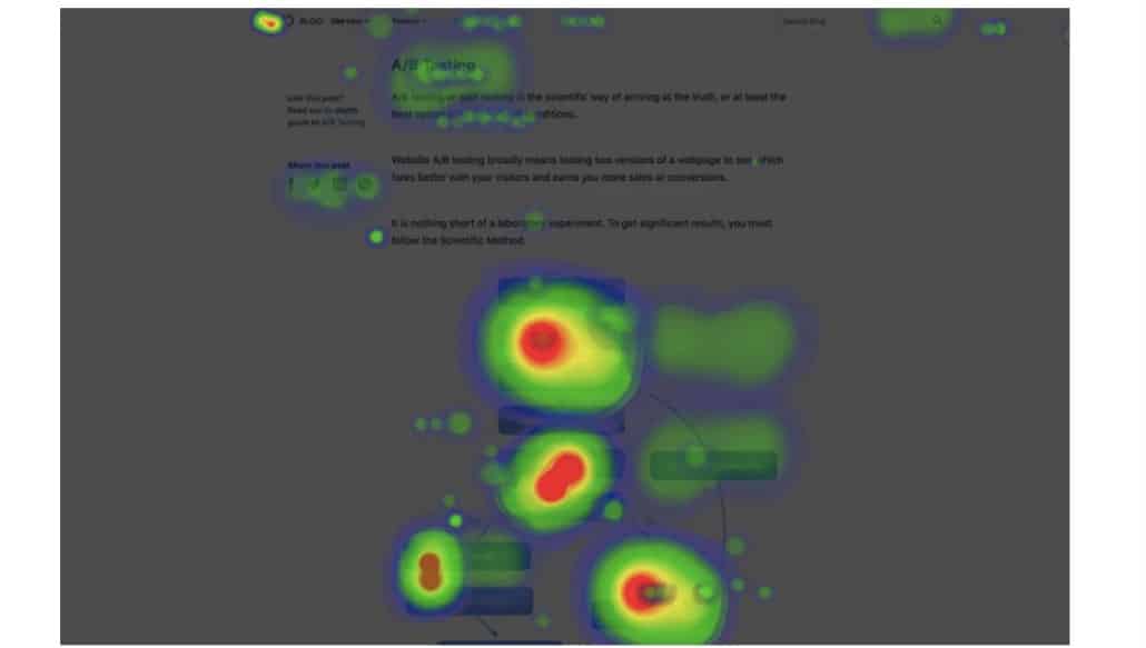
Image sourced from vwo.com
2. Click maps
Click maps can be far more useful to marketing teams. They show aggregated data of where and what users have clicked on. Blue areas on the map show elements that have few clicks, reds show a medium level of clicks, and the areas of your site with the most clicks show as bright white or yellow.
The big advantage of click maps is that they give you information quickly. They can help you identify areas of your website that need optimization or changing and let you see what things are working well as far as users are concerned.
They can also help you identify elements—such as a photo—that are getting lots of clicks but do not contain a link. You can then make an informed decision to add a link to that element.
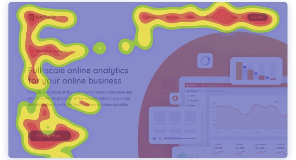
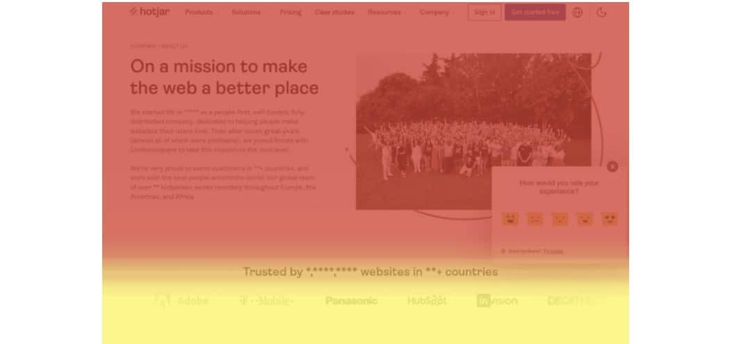
Image sourced from capturly.com
3. Attention maps
Attention maps are quite similar to click maps but instead of clicks, they show you what areas of your page/site have been viewed by the user’s browser. This type of heat map takes into account how long a user spends on an individual page as well as how they scroll through a page (both vertically and horizontally).
Attention maps also take into consideration that users may be viewing your page with different screen sizes or resolutions so that you get an accurate picture of what is visible to them.
This information can help you design new pages as well as optimize existing ones, as it lets you know the different experiences users encounter. Just as you might utilize social listening to see what people say about your brand, attention maps can track how people interact with your brand.
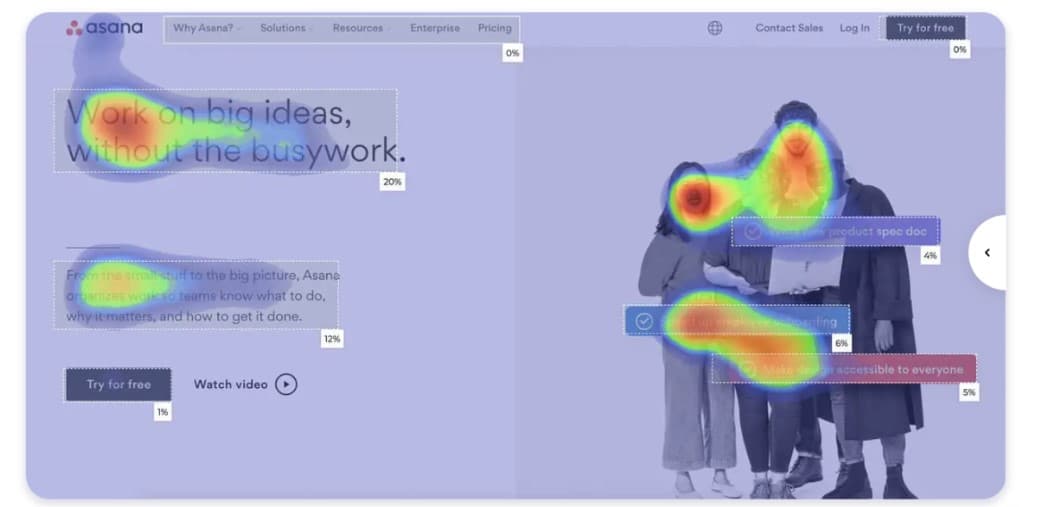
Image sourced from attentioninsight.com
4. Scroll maps
Do you have pages on your site that contain a lot of information and/or text? If so, then scroll maps may be extremely useful. Although this type of heat map works on any page, they are especially helpful when it comes to those pages with lots of content. In essence, they let you see how far users scroll on individual landing pages.
If you have important content located in the lower reaches of the page, users might miss it if they are only scrolling down for part of the page. Using scroll maps can help you redesign pages. You can reduce the content or relocate essential points to higher up the page.
That way, even if users only scroll for half a page, they will see your prioritized content, such as CTAs (call to action).
The data for all these maps is readily available and ready to use. It should be even easier to harvest if you use specialist tools or have enterprise application integration services implemented.

Creating heat maps
So, you now have an answer to the question, what is heat mapping? You can also see how each may offer benefits in different ways, but how do you take the data you have collected and turn it into a heat map?
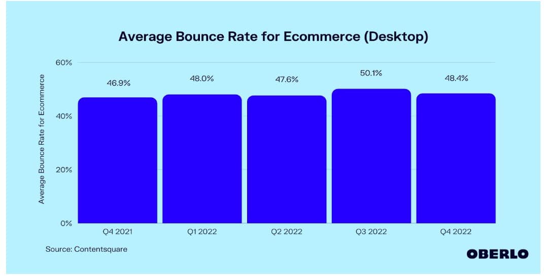
Image sourced from oberlo.com
As with other challenges in business, such as how to call a phone number from a computer, the answer lies in tools or software. There are numerous options available that can create heat maps from the data you have. When choosing, think about the type of heat maps you want to focus on as well as the budget you have available.
Once you have chosen—and bought—a tool that suits you, there are four steps between that decision and having the heat maps provide results.
- Goals. What are your goals? You may have decided to use heat maps because you’re seeing high bounce rates or you want to carry out concept drift detection. Knowing what you want your heta maps to track is the first step in the process.
- Areas. Given time, you may choose to use heat maps for every area of your site. However, you may want to initially choose areas and/or pages that you feel may be underperforming.
- Generation. Once you know what you’re trying to achieve, you can use your chosen tool to generate the actual heat maps.
- Analyze. Of course, the whole point of using heat maps is to have a visual representation of your data to make it easier to analyze. Your analysis can help you see where some work needs to be done.
- Repeat. Your heat maps may have led to changes and optimization in various areas. But have those changes worked? Repeating the exercise can gauge how successful any changes have been, as well as tracking changes in user behavior over time.
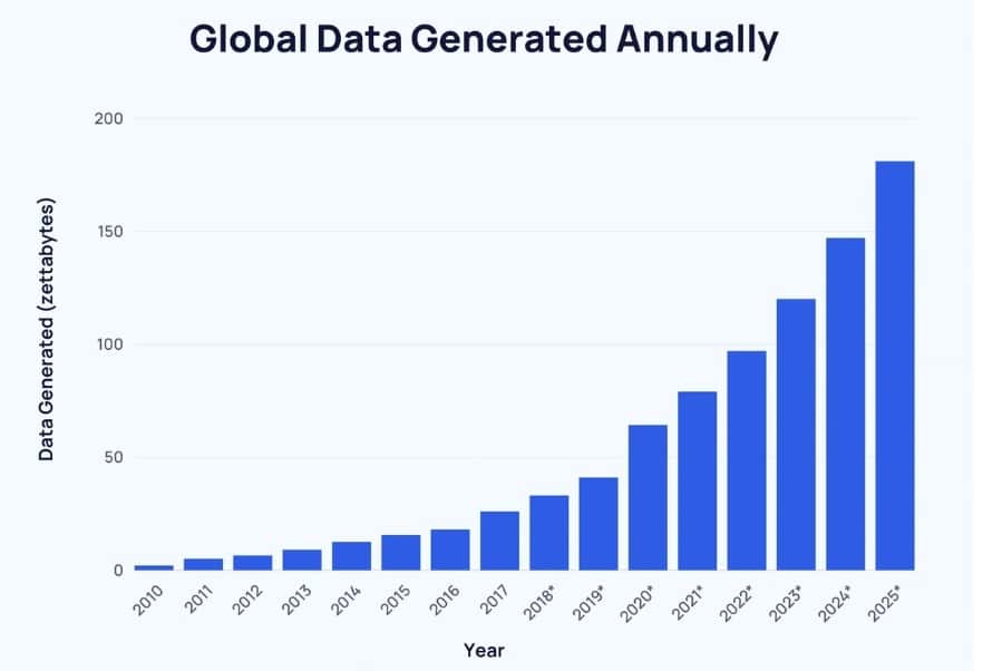
Image sourced from explodingtopics.com
Best practices for heat mapping
If you’re going to use heat maps regularly—and you should—then there are some best practices you should be following.
1. Accuracy
Any analytics tool is only as good as the data you have, and heat maps are no different. Make sure that the data you use is accurate and that any sample sizes you use are appropriate.
If you have 500,000 users, a sample size of four is not going to give accurate results. If you are generating large amounts of data, look at using acceleration tools such as NVIDIA RAPIDS with Apache Spark 3.
2. Demographics
While you may initially generate general heat maps that give you overall insights, you may want to divide your heat maps according to your identified demographic groups. You may find that heat maps can show different behavior from these groups. For example, one age group may scroll further down a page than another.
3. Combine
As with other analytical tools, you may find that results can be improved when you combine two or more tools to give more accurate insights. Google Analytics can be a great choice to combine with any tool you have chosen to buy. You can also use results to improve marketing and PR tactics.
4. Compliance
One important thing to remember is that, as with any collection and use of data, there are ethical considerations. If you are collecting data to use for heat maps, ensure that users know that you are tracking their behavior on your site and that you’re collecting data.
The takeaway
As a marketing professional, you will likely have countless tools at your disposal. You may then ask “what is heat mapping going to add to that arsenal?” The simple answer is that it is a simple way to visualize data that will, in turn, lead to an improved ability to make informed decisions. Those decisions can have dramatic effects on many of your most important metrics.
The other thing to consider is that in management meetings, agendas can be hectic, and there is not always time for you to explain lists of data. Heat maps are a solution that is easily understandable by anyone with only the most simple of explanations.