


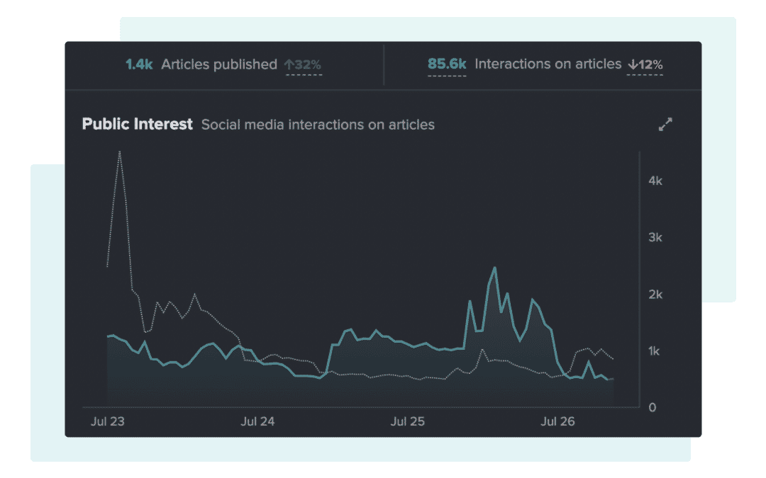
Timeline now delivers visualizations that help you quickly understand if media and public interest in any topic you are monitoring is up or down since the previous period.
Assess change in interest at a glance
The Timeline widget gives you hour by hour, and day by day graphs of real-time public and media interest in any topic. For a comms professional, it can be difficult to understand the state of play for the many topics you have to monitor on a daily basis, but not anymore.
Timeline now shows you the level of public and media interest for the previous period of the topic or keyword you are monitoring.
The addition of this visualization means that you can save time when you need to contextualize whether a topic is increasing or decreasing in engagement since the previous period such as yesterday, or last week.
Check out the below video to see how it looks on the Timeline widget.
Save time answering the important questions
On top of these visualizations, the Timeline widget will also give you the metrics that tell you by how much interest has changed since the previous period.
So now when you’re asked if the public still care about a certain topic or PR campaign, you can quickly put numbers behind how much the media is writing about it, how much the public are engaging with it, and whether it’s 10% up or down on the previous period.
If you are an existing NewsWhip client, your Customer Success Manager can get you started with the latest update to Timeline. Click here to email your Customer Success Manager.