


Convincing clients or colleagues of an emerging trend or crisis, or what the next big story will be, can be difficult. Using data can help, but incorporating it into your storytelling isn’t always easy. That’s why we’re building new tools to make it easier for you to tell data-informed stories. These tools will empower you to share insights, collaborate with your colleagues, inform your clients of the latest developments, and make data digestible at a glance.
We’ve introduced new features that allow you to add annotations to our Timeline graphs, and then export and share your Timeline data in the format that works for you.
These new features will help you to add context, present and share data easily, and tell compelling stories. Here’s what we’ve built.

Use Timeline Notes to give the data context
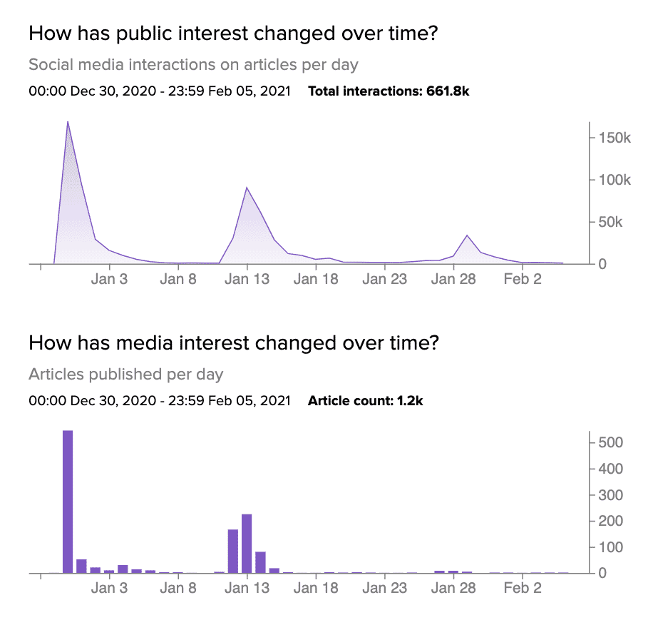
Timeline shows you how public and media interest are changing over time, and now with Timeline Notes you can add annotations to the public and media graphs to highlight significant points of interest.
The simplest application of this is to add context for yourself as you jump between dashboards, giving you a quick reference point on what is driving changes in public and media interest, or the important articles at any particular hour or day.
More importantly, adding Timeline Notes lets you add context to the data before you use our new sharing features to export it and share it with your colleagues or clients. This makes the data easily digestible for those seeing it for the first time, and brings a full picture to the story you are telling.
Click here to view a dashboard with Timeline Notes in use to see how you can use it in your team.

Create professional PowerPoint presentations with Timeline Graphs and Notes
You can now export Timeline graphs into a native Microsoft PowerPoint file. These .pptx file exports include all of your Timeline Notes, and work with your Microsoft PowerPoint themes so they match your style in a click — allowing you to deliver beautiful, on-brand, professional presentations.
The data in your PowerPoint exports are fully customizable, so you can work with the raw data behind the charts. This allows you to update and edit what’s included, using native PowerPoint tools to make sure your presentations show exactly what you want them to show.
Click here to download an example of a NewsWhip Timeline .pptx slide so you can test how it works in your decks.

Quickly share visual updates with Timeline PNG images
Sometimes a whole slide deck isn’t necessary, especially if you want to share quick insights by email or Slack. Now you can export PNG images of Timeline Graphs for easy sharing.
Choose from an image of the public interest graph, the media interest graph, or export them together in one image file. Each image includes interaction totals and article totals to make it easy to understand the size of the topic, event, or story.
Click here to view an example of a NewsWhip Timeline public interest graph, a media interest graph, or both together in one image file.

Deep dive into Timeline data in Microsoft Excel
Now you can export Timeline data into a .csv format for use in Excel, Numbers, or Google Sheets. These Excel exports give you raw data, by hour or by day, along with all Timeline Notes that you’ve added.
To make comparisons with other metrics easier, you can export Timeline data, allowing you to easily combine those data sets and understand the role of public and media interest within the larger context.
You can also use this data to build native charts in other applications, such as Google Slides or Keynote.
Click here to download a .csv of Timeline data with Notes.
We’re excited to launch this, and looking forward to sharing what’s next as we give you more features to empower your storytelling.
This release is a huge step in helping you to take valuable insights from Spike and share them with the right people, in the right format, at the right time.
If you are an existing NewsWhip client, your Customer Success Manager can get you started with Timeline Notes, and exporting and sharing Timeline data. Click here to email your Customer Success Manager.


