Do Your Visuals Match Your Brand?
Recently, I began watching Vikings: Valhalla, which is set more than 100 years after the ultra-popular Vikings and delves into the last years of the golden age of the iconic warriors.
The visuals are stunning. Spectacular. Sensational.
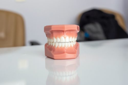
Especially one thing. Make that 28-32 things.
It’s their teeth. Each character’s teeth are stunning. Spectacular. Sensational.
Between the childhood braces, clear veneers, and regular whitening appointments at the dentist, the characters have perfect pearly whites. And it is weird. So, so weird. I find myself enthralled by the acting and drama, especially the care spent on the authentic hair, wardrobe, battle scars and sets. Then a character smiles or laughs, and I am taken right from the action again and again. The perfect teeth are distractingly beautiful given the story is set around the year 1000 (braces were invented in 1819, veneers in 1928, and teeth whitening in the 1960s)
This tiny oversight is a great reminder: if you are going to invest in your brand, especially when it comes to a brand’s visual appearance, be consistent. The logo, website, social media pages, merchandise, giveaways and uniforms should work together to build the brand, not distract from it or send mixed signals.
And how should you stop others from mis-using the brand? Create a brand book with all standards and usage rules. Make sure it has all of this, and consider working with a professional (like our team here at HMA).
Don’t be a Viking with perfect teeth.