


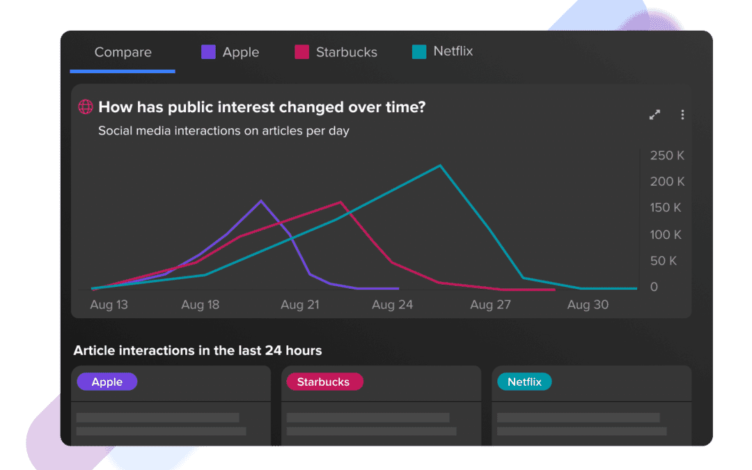
Today we’re excited to announce our latest feature, Compare, which further expands our crisis management capabilities.
When we launched Crisis Dashboard in October 2020, we brought the most comprehensive view of real-time news engagement and influence in the media and public spheres. Compare expands on our Timeline feature by giving you the ability to analyze media and public interest across multiple crises or events at the same time to better understand their impact at any stage of their development.
How Compare helps with three key aspects of crisis management
With any crisis, there are a number of key inflection points. Most crises aren’t a complete surprise, so preparing a strategy for when they hit is crucial, as is being able to contextualize what happens once it begins, as well as how your response is going.
Here’s how Compare can help.
1. Crisis preparation and research
It’s rare that a crisis comes completely out of the blue, which is why both risk management and crisis preparation are crucial. Companies are often hit with something beyond their control that might be unavoidable in their industry, and it’s important to have a plan for if and when that happens.
Companies aren’t so isolated when it comes to crisis. Very often, a version of your crisis has happened to industry peers, and that’s where Compare comes in. The view allows you to research past crises and normalize their dates to start from a given day over the course of their lifetime. This means you can use this multiple crisis view to understand key inflection points in each narrative. Did the crisis begin when a certain publisher covered the story? Did an influencer drive the bulk of the engagement? How long did it take public interest in the crisis to hit a peak?
Compare helps you answer these questions so you can plan for the eventuality that it happens to you. It gives you advance warning of when the media or public are beginning to pay attention to the same level they did to a previous example, so you can act accordingly.
For example, you may have recently suffered a data breach, and you must now prepare for dealing with that crisis before you or the media make the announcement.

Using Compare to gather insights on previous data breaches, you can see how long the crisis is expected to last, how much public interest there was, and the media outlets driving the conversation. When you prepare with this data, you can plan accordingly and minimize the impact of your crisis.
2. Crisis measurement and benchmarking
Once a crisis does hit, it’s important to be able to properly contextualize it for stakeholders. How does this crisis compare to the levels seen in another well-known example?
Our new view allows you to quickly compare the trigger points, peaks, and changes in public and media interest in a previous crisis against the current news cycle of your crisis.
By using Compare, you will be able to track your crisis and understand whether it is approaching the inflection point of previous crises, and time your response so it is best positioned to slow the spread of the crisis, and positively influence public perception for your brand.
Very often in the midst of a crisis, stakeholders want to be able to understand it in terms that are relatable. This can be difficult when citing raw numbers alone, and this visualization presents the data in one simple, easy to interpret view.
Having this level of insight makes it easier for you to tell the story of a crisis, and get the buy-in and resources needed to put your response plan into action.
3. Crisis response
When it comes time to respond, it’s crucial to have the data that demonstrates how impactful that response is.
In the recent crisis for Starbucks surrounding a ban on employees wearing clothing that supports BLM, contextualizing the response was vital in measuring its success.

With Compare, you can track the real-time data that tells you if your response is resonating with the public. Thanks to our powerful Boolean search, you can isolate your response from the overall crisis conversation. By doing this, you can assess whether your response is becoming the dominant narrative in the crisis and you can watch how it changes public and media interest in the crisis.
If the crisis isn’t slowing down, you then have access to our social network feeds to dive into the conversations to assess public perception on your response. If distribution is the problem, then you can use top authors leaderboard, and top websites leaderboard to identify the best place to further amplify your response.
Using Compare in the overall crisis management context
Compare is the latest addition to our Crisis Dashboard. With this new feature, you can build the most impactful and data-informed crisis response team that not only responds quickly and effectively to crisis, but mitigates the risk of crisis thanks to our powerful features.
You can take the guesswork out of understanding the size of a crisis by using Compare, as well as measuring your response when analyzing the outcome of a crisis once the dust has settled and it returns to business as usual.
If you are an existing NewsWhip client, your Customer Success Manager can get you started with Crisis Dashboard. Click here to email your Customer Success Manager. You can also get started by following our help guide here.
If you are new to NewsWhip, then you can request a demo by clicking here.