")
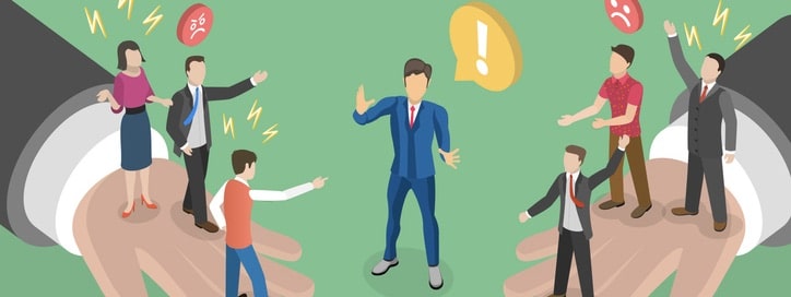
Rebranding is tricky—it’s often hard to know what strategies will be embraced by audiences, and which will miss badly. A new survey report by Visual Objects, a visual guide to finding the best creative firms, offers some insights into some examples of each, highlighted by the success achieved by Dunkin’ Donuts.
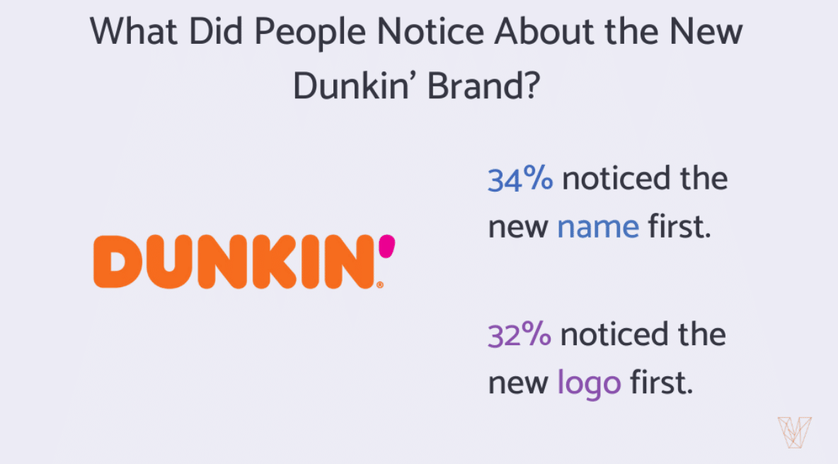
The firm’s research found that one-third (34 percent) of people spotted Dunkin’s new name immediately after seeing the rebrand. The survey of 501 people in the U.S. also features data about WW, previously Weight Watchers, and IHOP.
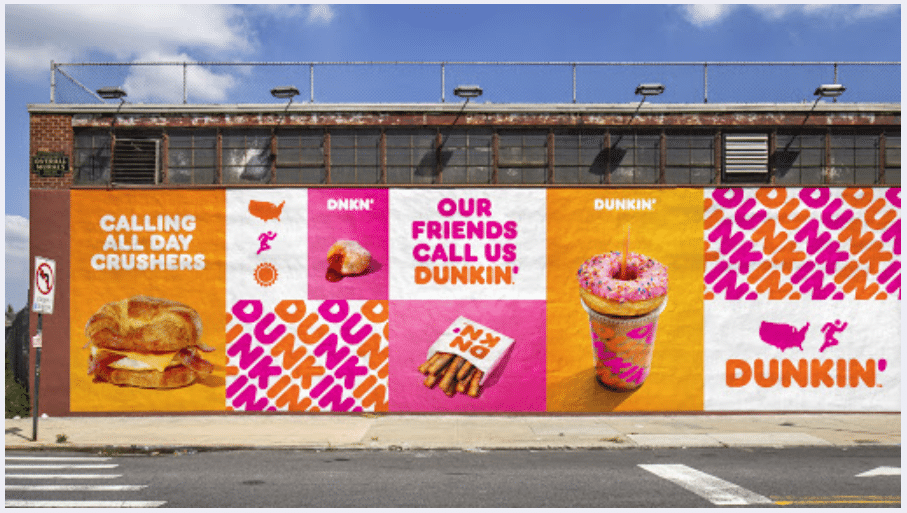
Companies typically modify their branding to align with changing business priorities or to keep up with the times. Dunkin’, for example, rebranded in 2018 after deciding to prioritize its coffee beverages and speedy service.
Not all rebrands work, but Dunkin’s did. Laurel Sutton, senior strategist and linguist at Catchword, explained why: “Rebranding efforts succeed when the new brand is already in use by consumers. People already referred to Kentucky Fried Chicken as KFC when the company made the change.” The same goes for Dunkin’.
Some branding changes are more distinct to consumers than others, so businesses should think carefully about which elements to invest in.
Consumers notice big logo rebrands
While most customers noticed Dunkin’s name change, the company’s new logo also caught eyes. The survey revealed that 32 percent of people were drawn to Dunkin’s new logo, while only 10 percent noticed the new colors.
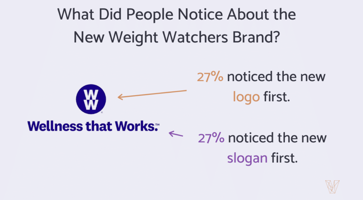
A similar trend presented itself in two other food brands. One-quarter (27 percent) of consumers were instantly drawn to WW’s new logo compared to 17 percent who were drawn to the new colors after the company shifted to a wellness-centered approach.
However, just because consumers noticed WW’s rebrand, doesn’t mean it was successful. “Saying ‘W-W’ feels weird and awkward. We’ve known the name ‘Weight Watchers’ for years and it’s the program we know and love,” said Sara Borgstede, WW customer and blogger at The Holy Mess, in a news release.
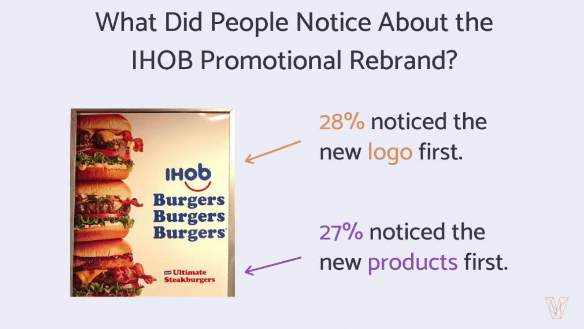
Additionally, IHOP’s 2018 IHOB logo change, which was part of a marketing ruse, immediately caught the attention of only 28 percent of consumers, which is surprisingly low given the strangeness of the modification.
Some consumers don’t catch sight of rebrands
Businesses spend a lot of time and money on rebranding, but some consumers don’t notice every detail right away.
In fact, the survey found that 13 percent of consumers didn’t immediately recognize any differences after Dunkin’s permanent rebrand and IHOP’s temporary name change.
Visual Object’s survey also includes data on Burberry and Microsoft.