So the hard work is done. You’ve pulled off the campaign and the coverage has rolled in.
You want to do a similar campaign. But next time bigger and better.
To get the extra budget signed off you need to showcase the campaign.
You’ll need to get your boss, your bosses’ boss and your bosses’ bosses’ boss to read and engage with your report. For this, you’ll need it to stand out.
Having great results are futile if no one sees them, so you need to make the book as engaging as possible.
There’s one simple feature that can transform your coverage books from meh to wow.
And that’s a divider. It really doesn’t sound like much but with a divider you can:
1. Break up the coverage and bring the campaign to life with imagery
2. Make your reader pause or reflect on a stat or key message
3. Merge in any additional pieces of coverage or reports (such as social monitoring or showcasing a billboard advert)
4. Upload Word or PowerPoint documents to give more context to the report. Perhaps there is a list of forthcoming coverage, or you want to recap the initial idea presented. If you have these in another format you can upload them to the report
Look through this book to see what I mean:
Check out these dividers
1. With dividers the design is completely in your hands, so here’s some tips from our designer, Stefan on how to make the dividers look super sleek:
2. Less is more so if in doubt keep it simple
3. Don’t try and cluster your slides with too much informationIf an image makes the point really clearly brilliant, use it. If nothing springs to mind don’t try and shoehorn something in just for the sake of it
4 . If text will make a clearer point, then use a simple background colour so you can make your point clearly and effectively
“If there is an image that really conveys what you’re trying to say, then the right image can be really powerful, but you have to stick to a few rules to avoid it looks too busy when you overlay text”
5. Contrast is key so the text stands out and the image is readable
6. Keep the image very simple so it is not too cluttered once the text is overlaid
7. Blurred images that convey a mood through colour help different colour test stand out
8. Images with strong shapes or block of colour will give the text something to stand out against
Image resources
1. There are loads of great paid for image libraries such as Alamy and Shutterstock
2. If you have limited/no budget then check with your client/in house team as they may have assets available for you to use
3. If you are still after images, Pixarbay is great for finding images copyrights under Creative Commons CC0.
4. A with using all images, please avoid cheesy stock photographs of fake smiles and 70s briefcases!
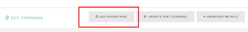
You can find dividers here:
If you are not a customer already, why not? You can sign up for a free trial here
Originally published at coveragebook.com.
