%20Logo_BlueOrange_Trademark.png?width=800&height=269&name=Ready%20North%20(RN)%20Logo_BlueOrange_Trademark.png)


.jpg?width=300&name=Services%20Hub%203%20(3).jpg)


 Editor's note: This post was originally published in 2013 and has been updated to be more current and comprehensive.
A flowchart—the visual representation of a logical progression of things.
In my humble opinion, one of man’s greatest accomplishments, right next to the spork.
I was introduced to the raw, unrelenting power of a flowchart when my brother—a mechanical engineer—put one together for his wedding. This piece of art showed the different locations where we were to take pictures throughout the day, contingent on whether it was raining. A complicated matter to keep track of and communicate turned simple with a couple bubbles and diverging connector lines.
Magnificent.
Since that day, I try to use flowcharts in everything I do—electrical wiring system configuration, sewer navigation and tracking marketing campaign performance.
I’ve found that flowcharts create an extremely systematic means to visualize and make sense of marketing performance data, so that data-driven marketers can better associate metrics with specific campaign activities to measure their true impact.
Why is there a need for this type of data organization? According to Forbes, tracking marketing data proves campaign success and ROI. However, a startling 74% of marketers say they can't properly measure how their efforts impact business using data.
Tying performance data to specific campaign activities is complicated and often neglected, but when presented in the correct format can help you visualize how well each campaign activity drives audiences to take the desired actions.
Below I’ll walk you through the six steps needed to create a granular marketing dashboard flowchart, which can then be used to supplement your existing campaign performance tracking efforts.
Pre-Step: Know Your Tracking and Reporting Tools
The most important aspect to tracking your campaign performance is becoming an expert in the technologies you use to monitor said performance. Only with this expertise can you know:
- What metrics are available to you.
- How to integrate them to track your campaigns accurately.
In addition, you must know what other technologies exist to supplement your current systems and fill any holes they may have. For example, if your audiences prefer to call rather than fill out a form, you’ll likely need call tracking to associate offline conversions with your campaigns.
As you’ll see when you get to Step 3, you have to be able to track all the various ways your marketing efforts are driving results, otherwise, you’ll be working with incomplete data and never know the campaign’s true impact.
In addition, when possible, make sure all these tracking technologies feed data into one single source of truth. Jump to Step 6 to uncover a technology that will help you visualize your marekting data in one dashboard.
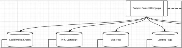
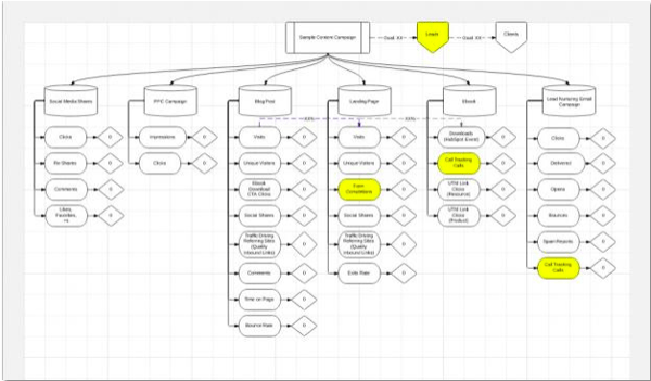
Step 1: List Out Your Campaign Activities
With tracking technologies at the ready, your first step is to define the campaigns you are currently running, and those you plan to run, and then list out all the activities associated with each.
For example, as part of a content-focused campaign designed to drive sales-ready lead volume, you plan to publish an ebook, four blog posts, 20 social media posts, a three-part lead nurturing campaign, and run a small PPC campaign.
Each of these activities should have their own flowchart bubbles (see below).
Step 2: Brainstorm Interaction Points
Lock yourself in a room, put on some vintage Michael Bolton and submerge yourself in your target audience’s user experience. Brainstorm all the different ways someone can interact with each specific marketing campaign activity. Ask yourself, can they:
- View it
- Click it
- Share it
- Call it
- Link to it
- Comment on it
- Download it
- Cite it
- Star it
- Review it
- Buy it
At this point, you’re not looking at what they can do before or two steps after they saw the specific campaign activity, only what they can do directly following the moment they came across it.
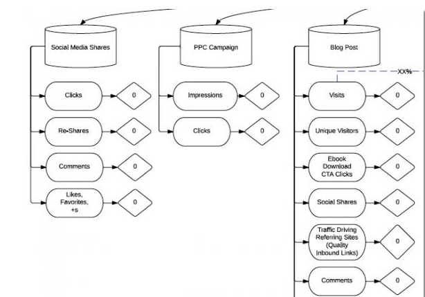
Step 3: Align Interaction Points with Metrics
Pair campaign interaction points with the metrics made available to you by your tracking tools. If the interaction point can be recorded, add it to your flowchart.
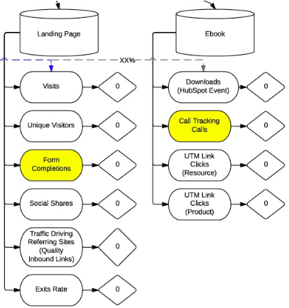
Following are some (not all) of the ways to track a couple of the campaign activities mentioned in Step 1.
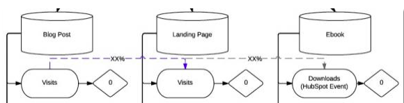
Depending on the flowchart program you use—I’m a fan of LucidChart—you can also add connector lines showing percent of individuals progressing from one campaign activity to another. For example, percent of blog post visits that went to a landing page.
Step 4: Configure Your Tracking and Reporting Technologies
Now that you’ve got a list of all the various ways people can interact with your campaigns, you need to configure your tracking technologies to be able to capture them.
Your out-of-the-box tracking technologies will take care of recording and associating most metrics with your different campaign activities. For example, with Google Analytics installed, you can see how many times a blog post served as an entrance page, how long visitors were on the post, and how many people left without taking any action.
However, there will likely be a number of things you’ll need to set up manually. Following are some to think about. (This is not a complete list, nor will each be relevant to all campaigns.)
- Append UTM tracking to the end of all links pointing back to your site.
- Set up event tracking to capture interactions with buttons on your page.
- Assign static call tracking numbers to offline marketing materials to capture offline conversions.
Step 5: Factor in the KPI Qualifier
The metrics outlined in Step 3 are essential to understanding which activities performed well. But, the problem is that without some way to qualify the metrics, it’s hard to say whether your activities are driving and engaging qualified audiences.
Qualify your campaign performance data by adding in a key performance indicator (KPI) or two. KPIs are the main metrics your marketing efforts are designed to improve—typical sales-ready leads and/or customers.
In your flowchart, add KPI bubbles to show how many new leads and/or customers interacted with your campaign activities before converting.
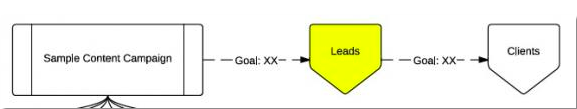
You can also call out specific bubbles within the flow chart as lead conversion points (i.e. form completion, phone call, webinar registration), as shown in yellow.
This type of tracking can be done through Goals and ecommerce tracking in Google Analytics, or a platform like HubSpot or Marketo. For example, in HubSpot I can see if a new lead arrived to, or viewed, one of my blog posts before converting.
Step 6: Visualize Your Data
Now that you have your KPIs defined and reporting technologies configured, it's time to pipe that data into one source of truth and visualize it. Using a tool like Databox, you're able to streamline KPI reporting using visual charts and graphs for real-time, easier analysis.
The result? You're able to:
- Focus on metrics that matter, and set up dashboards for website analysis, blogging performance, lead generation results, financial health and more.
- Identify areas that need attention using real-time numbers vs. waiting until the end of the month, quarter or even year to identify underperforming metrics.
- Bring all data sources together (HubSpot, Google Analytics, Salesforce, Facebook ads, AdWords, etc.) to visualize in on hub, rather than pulling various results with misaligned data.
- Share your data story with others by layering analysis notes and calling out key highlights.
>>>Related resource: 5 Ways to Boost Your Performance Reporting with Data Visualization from Databox
Supplement to Existing Analytics Tracking
Campaign tracking at this granular a level is not for everyone or for every campaign. In addition, it does not replace the need for ongoing daily monitoring of overall website traffic, sources and visitor activity, which are essential to identifying opportunities and issues, and processing them in real time.
These types of flowcharts are great for complex campaigns that can potentially generate a good deal of interaction with target audiences. Set them up at the start of your campaigns, and then update them on a monthly basis, or when evaluating campaign performance.
In all likelihood, your flowcharts will serve as an internal tool and supplement your existing reporting; many managers and clients won't want to see this level of data. Use it to help you better evaluate the true effectiveness of specific marketing initiatives, which can then be used to analyze and evolve your campaigns more efficiently.
What strategies do you have for campaign tracking? Share your ideas below.


COMMENTS