


Today, we’re announcing the world’s most comprehensive view of real-time news engagement and influence.
It’s called Crisis Dashboard, and it will enable both communicators and journalists to unpack, in real time, all the public dimensions of any acute news event.
The Crisis Information Gap
For global companies, reputation is the new gold. According to Gartner’s 2020 survey, CMOs, who once sought brand awareness above all else, now seek positive brand perception and trust. They’re right to do so: In 2020, one in two consumers globally say that lockdown has made them more likely to buy from brands they trust.
Meanwhile, the threats to reputation have never been more variable or complex. In the modern information sphere, crises are more common and can explode within hours through a vortex of media, social media, and motivated groups primed to pounce on particular narratives.

Today’s communications professionals are tasked with the delicate work of anticipating, managing, and responding to reputation crises, often all at the same time — and with very little time for analysis.
Unfortunately, today those professionals have to do so with only the scarcest measure of the scale of a crisis – and no indicators of its drivers, rate of growth, or dimension of public interest.
They must rely on a hodgepodge of legacy media monitoring technologies, surveys, and direct social network access. These tools are not joined up — the links between what’s being written by the media and what’s being shared on social media are not elucidated. In many cases they live in different tools entirely.
Fundamentally this situation is not fit for a professional who must quantify, shape strategy, and make decisions about the world as it is this hour, today.
Similarly, for journalists who must interpret and report on controversies that play out on media and social media, existing tools do not suffice.
Crisis Dashboard
The Crisis Dashboard changes this. It gives an instant, comprehensive view of all dimensions of any acute news event. It highlights the news articles being written alongside the public interest in those stories. It provides social media discussion and perception. And it shows you the real-time media and social influencers for every aspect of the story.
Crisis Dashboard gives all of this insight as quickly as typing in a keyword, and is entirely based on the bedrock of our hard, real-time data and predictive media intelligence.

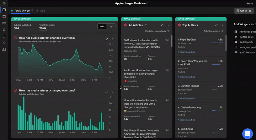
1. Timeline Mapping Media and Public Interest
First — the dashboard reveals, in precise real time, the public’s engagement with any issue.
Current media monitoring tools offer no indication of which matters are picking up steam. A negative story from a top tier publication might receive no engagement, while a crisis might explode from a fringe outlet that’s not on your radar.
Today, those tasked with reputation management react to the prestige of a publication, not the reality of a story’s influence. By fixating on media output, they focus on something that’s only tangentially related to the phenomenon we actually want to understand – the public’s interest and response.

To fix this, Crisis Dashboard provides a real-time view of both new media stories, as they appear, and public engagement on those articles, as each share, comment and tweet happens.
The view is fully interactive – zero in to see which story is gaining the most engagement, and the qualities of that engagement – likes, shares, comments or tweets. And it’s real-time – for those tasked with crisis response, you can easily monitor the effectiveness of an action by whether it receives engagement or changes the narrative.

2. Prediction and Predictive Alerts
Those whose job it is to understand crisis situations are used to interpreting yesterday’s data, not seeing tomorrow’s. Until recently, yesterday’s data was just what we had.
Our predictive media intelligence reverses that. Within your Crisis Dashboard you can select any article and see how big it was, is, and will be. Our models are hardy, and reliable – they already guide decisions daily at all of the top 10 global PR firms.

Crucially, the Dashboard also lets you know when anything is predicted to change about a situation. If an article is published about the crisis that our models predict will surpass a certain level of engagement, Predictive Alerts will let you know, so that you’re prepared for a public reaction – before that reaction hits scale.

3. Understand the Story Influencers
It takes considerable legwork to unpack influence around stories and events – to figure out which journalists most influence or engage the public on a topic, or which social accounts are amplifying it.
Crisis Dashboard will give an instant 360-degree view of influence, cause, and effect around a story.

In particular, our new Top Authors Leaderboard, shows which writers are driving engagement about the issue, and who has driven engagement about it in the past, to help you create the most data-informed media plan.
4. Comprehensive View of Discussion
Finally, most communications professionals rely on social listening to gauge public response. This generates a perspective almost entirely wrapped around Twitter, which has a limited user base and where 10% of accounts create 80% of the Tweets. Separately, it’s difficult for professionals to draw connections between Twitter chatter and news stories that are published, shared, and engaged with on other platforms.
NewsWhip now gives you a far more comprehensive view – with web, Facebook Pages, Snapchat, Instagram, YouTube, and verified Twitter accounts. Most recently, last month we released the most comprehensive Reddit monitoring solution in the world, and we’ve added it to Crisis Dashboard.

Navigate with Confidence
The modern information sphere is a complex space, filled with hard social, political and environmental questions. Our tools won’t tell communicators precisely how to respond, or journalists precisely what to write about.
What we can offer is a step change in how you navigate it. With a full understanding of the media, public and influence you can know where to engage, do so with confidence, spot emerging narratives, identify nodes of influence, convince your stakeholders of a course of action, and build reputation and trust.
Continuing Development of Crisis Dashboards
We’re releasing the Crisis Dashboard to all users of Spike in waves over the coming weeks, at no additional charge.
A last bit of exciting news: this beta is version one of Crisis Dashboard – we have additional transformative updates coming, before the end of the year. More on that next month.
Thank you to the members of our team responsible for the remarkable engineering feats, design insights and product vision behind this release. And a huge thank you to our customers and users with us on our journey building the next generation of media intelligence.
If you are new to NewsWhip, then you can request a demo by clicking here.
If you are an existing NewsWhip client, your Customer Success Manager can get you started with Crisis Dashboard. Click here to email your Customer Success Manager.